Charts & graphs
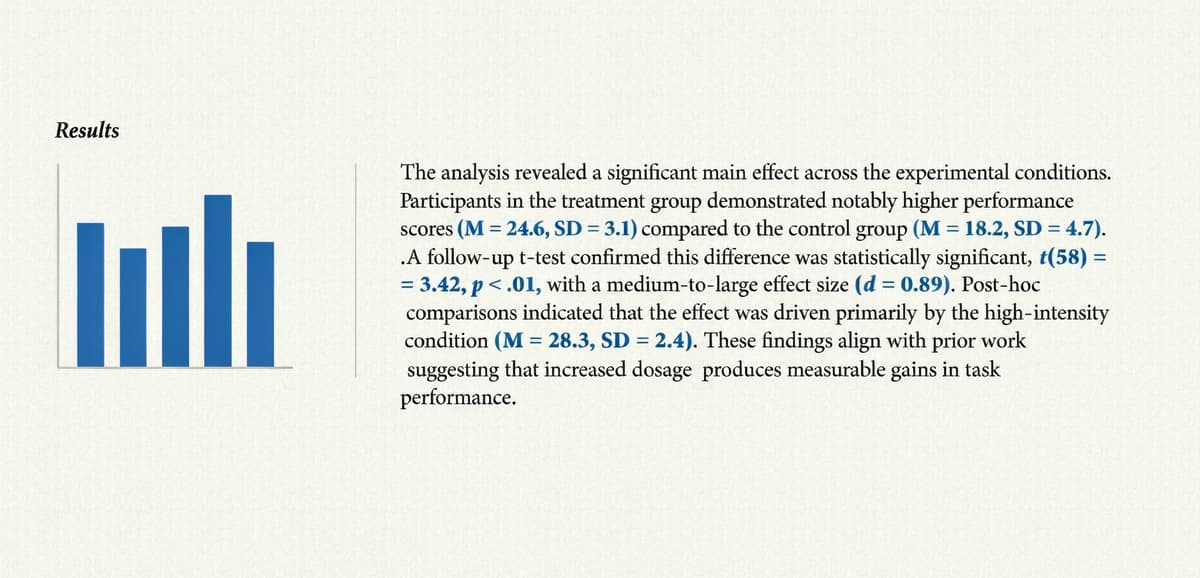
The everyday results-section chart, computed from your dataset.
Bar chart, Line/trend chart, Scatter plot, Pie/donut chart, Histogram
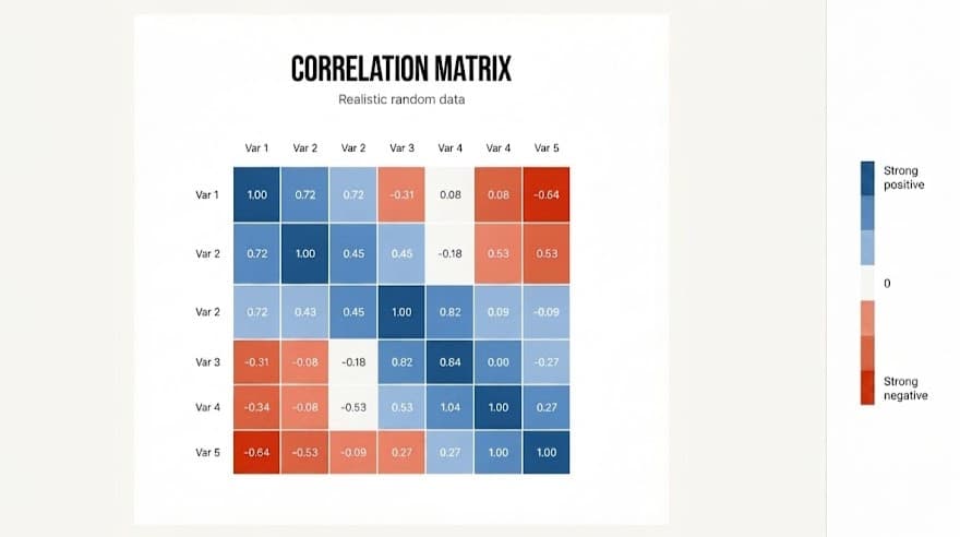
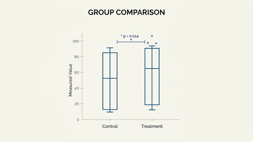
Box plot, Heatmap, Correlation matrix, Regression / best-fit line
We’ve built Multilo to provide assistance at every stage of your research. Its data visualization feature helps you develop charts, scientific plots, and spectra from your real findings and drops them straight into your draft. No need for separate plotting apps or exporting each chart individually
What Multilo can plot
Whether it is a standard results section bar chart or a fully annotated spectrum, Multilo covers every plot type that can come up across your thesis, dissertation, or manuscript. Organized and designed exactly for what you want
The everyday results-section chart, computed from your dataset.
Bar chart, Line/trend chart, Scatter plot, Pie/donut chart, Histogram
Box plot, Heatmap, Correlation matrix, Regression / best-fit line
Turn your data into scientific plots that fits your journal requirements
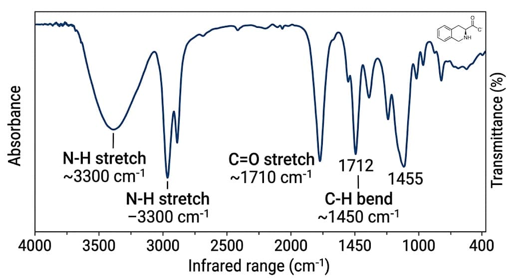
FTIR spectrum, UV‑Vis spectrum,
Error-bar plot, Dose–response curve, Peak annotation
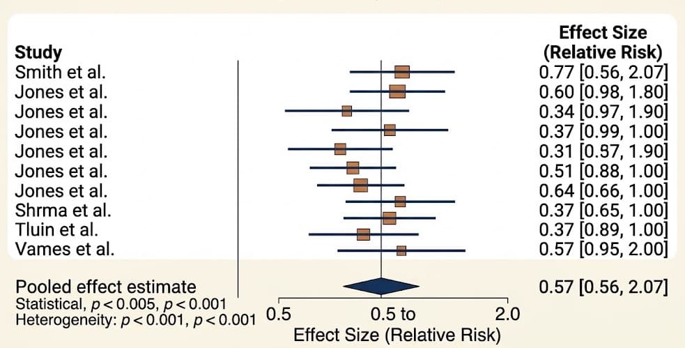
Get the tools you need to present systematic review findings
Forest plot,
PRISMA flow diagram
Get the written explanation that goes with your charts, not the visuals.
Descriptive statistics, trend summary, results paragraph
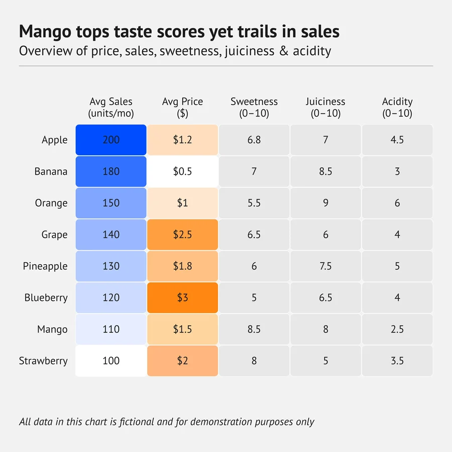
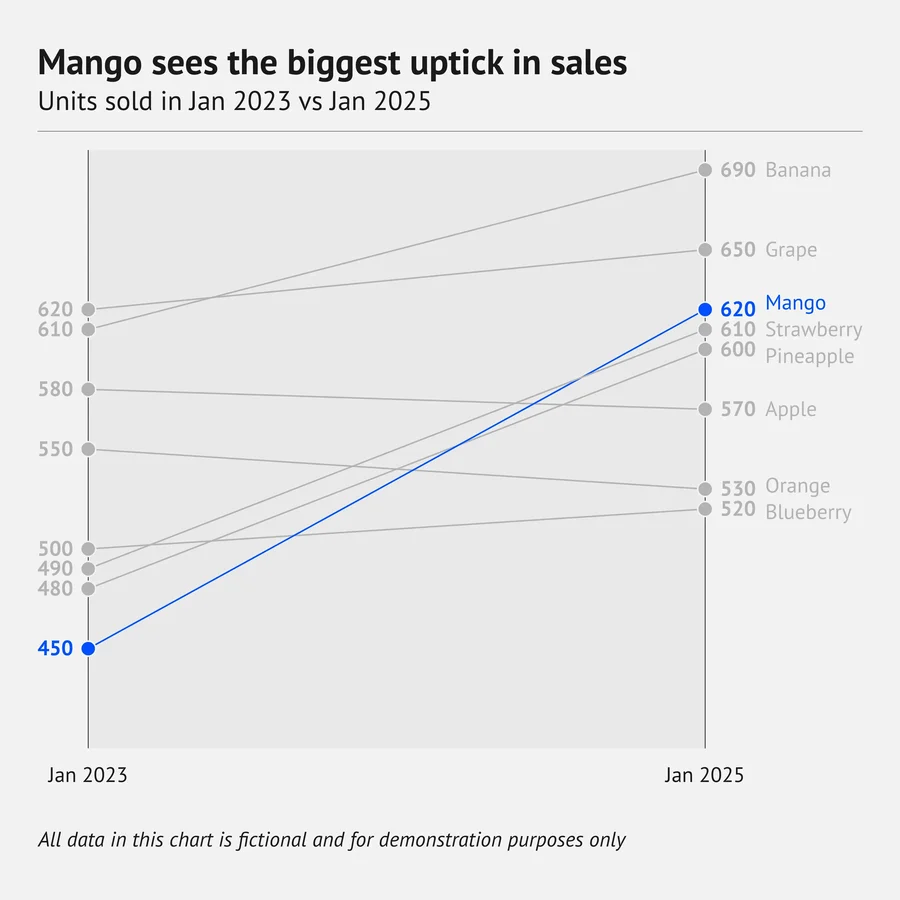
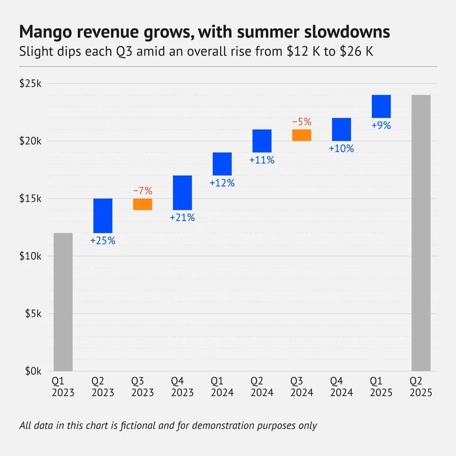
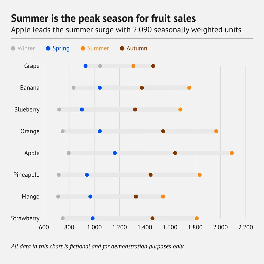
A calm, repeatable workflow for every assignment—all inside one project on your device
From your spreadsheet to a finished figure in your manuscript — every chart computed from your own numbers, styled to match your document, and placed inside it.
How Multilo compares to generic AI chatbots and a manual writing-plus-citation setup
| Feature | Multilo | Generic AI chatbots |
|---|---|---|
| Chart traced to real computed data | yes | - |
| Peak / functional-group annotation | yes | no |
| Finished chart lands in your .docx | yes | no |
| Style matches your document automatically | yes | no |
| Forest plot / PRISMA support for systematic reviews | yes | no |
| Runs locally — data never leaves your device | yes | no |
| Separate app and manual export needed | no | yes |
| Cloud upload required | no | yes |
A chart is only helpful if the data behind it is real without any errors. Most AI tools, when they convert your data into such visuals, make small tweaks to the information, and you have to double-check everything. While Multilo runs your dataset through the same computation every time and then renders the figure from that result so the bars, points, and peaks always trace back to your actual data file and is completely accurate.
Computed, not guessed: values come from your dataset, not a model’s impression of what a chart should look like.
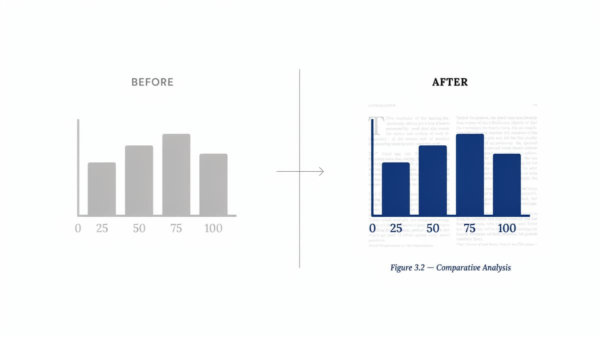
Consistent scales keep charts accurate and prevent small differences from looking bigger than they really are
Private by default: Your dataset is processed locally and never used to train a model.
Turn your research into accurate, publication-ready figures and supporting data analysis that your paper actually needs, enhancing quality and credibility of your paper.
Turn a lab spreadsheet into the figure and content your results section needs.
Add labeled FTIR or UV-Vis spectra with clear explanations of your findings.
Visualize trends across the studies and data you’ve collected.
Keep every figure consistent in style across every chapter.
Highlight a sentence and let Multilo paraphrase, expand, or summarize it — your sources stay linked and your references stay in sync.
Everything you need to know about writing with Multilo
Yes, you import an Excel, CSV or existing project dataset and describe what type of chart you want, and Multilo handles the rest. It computes it from the actual data you provide and places it in your draft directly, so you don’t need to do a separate copy-paste or export.
Yes, you can edit the chart after Multilo creates it. Whether you want to relabel any axis, change the color, or need to change the chart type, Multilo supports every type of editing and adjusts the chart according to your requirements.
No, there is no limit to how much data you can process for visualization. It handles typical research datasets, including lab measurements, survey responses, extracted study data, and others, without any difficulty, but the larger datasets may take longer to process.
No. Describe what you want in plain English, and let Multilo pick the chart type and build it. There is no need of manual configuration or to learn Python or any code language, Multilo handles everything seamlessly without any hassle.
Multilo runs locally on your desktop. Your dataset stays on your machine and is never used to train a model or kept as a cloud copy.
Download Multilo and turn your dataset into a chart, spectrum, or forest plot along with writing the full draft with every type of professional research assistance